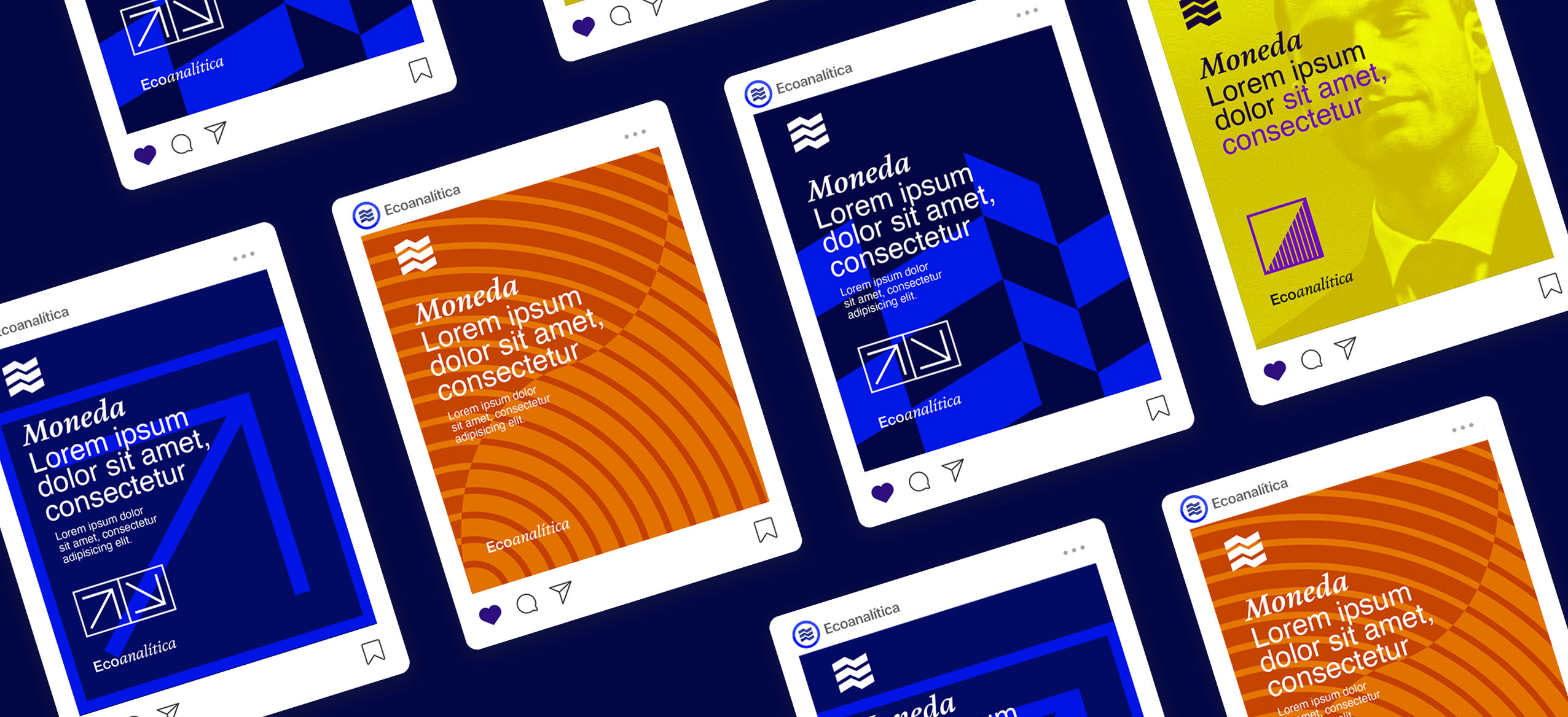
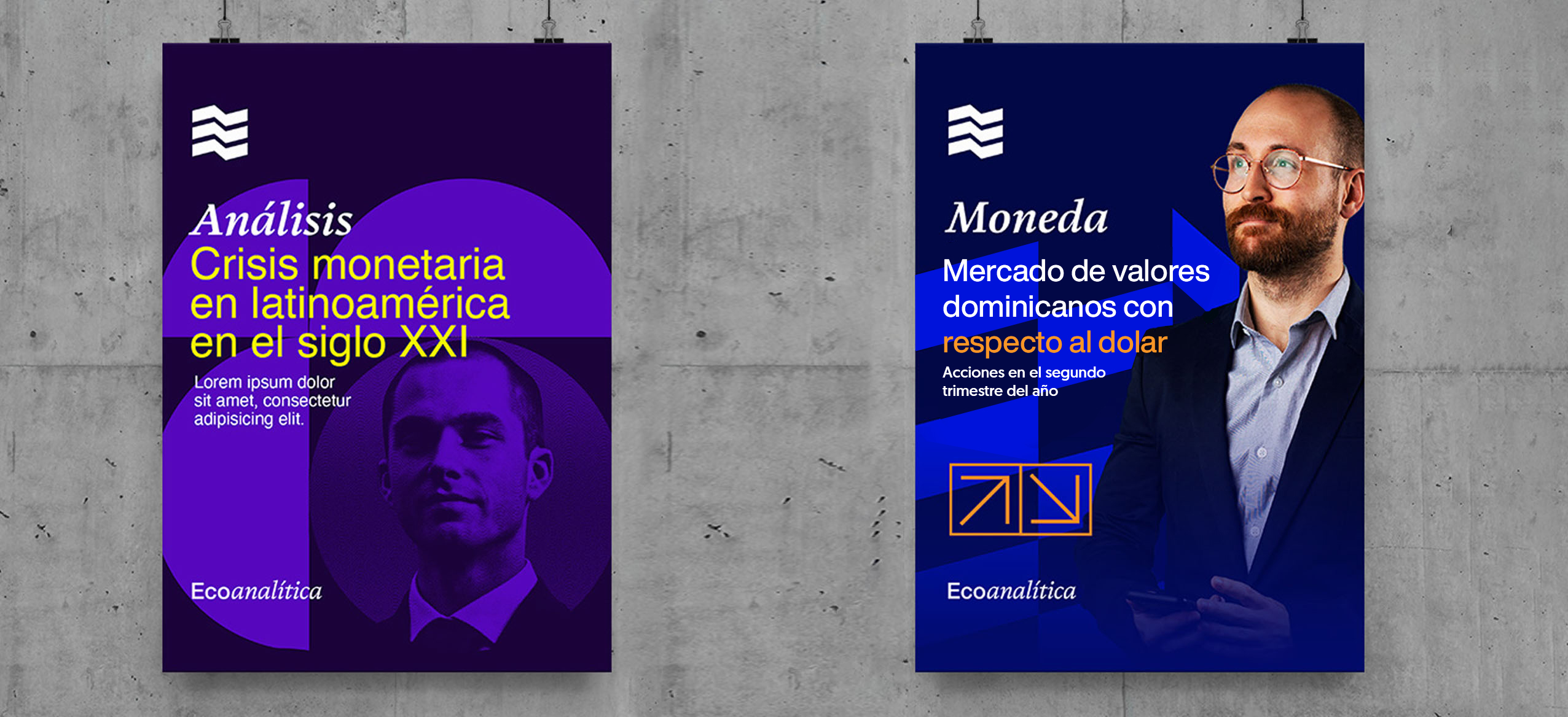
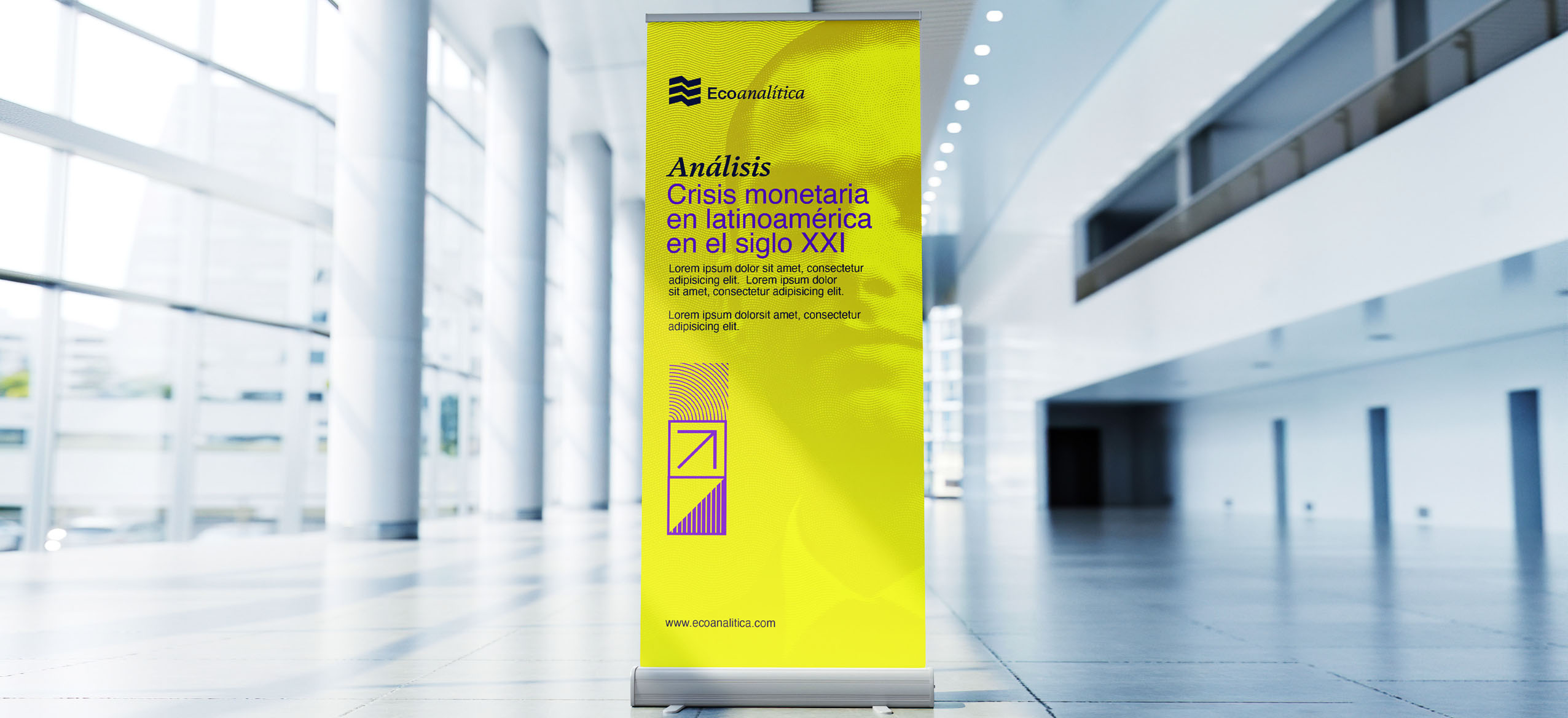
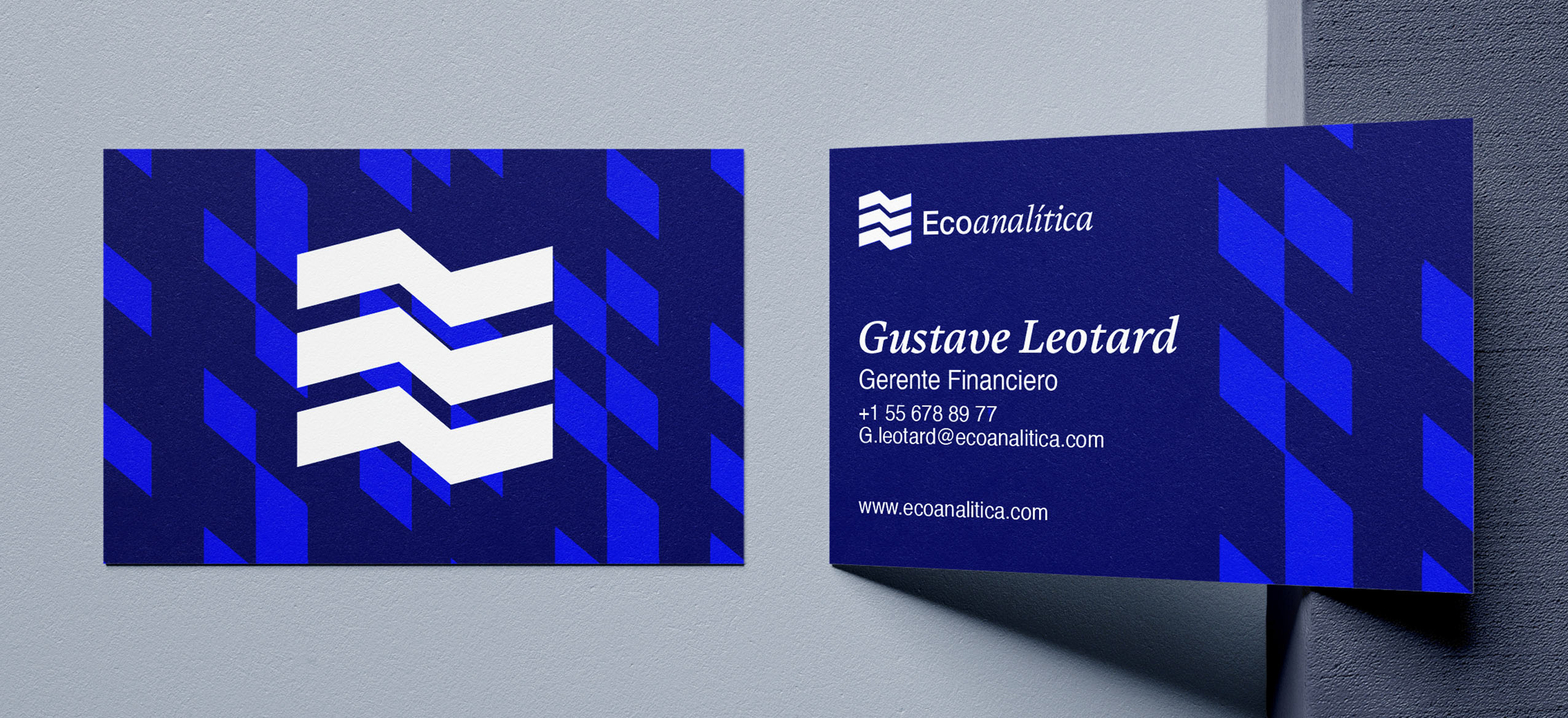
Create a visual identity that stands out in the economic sector, using a color palette based on shades of blue. These colors should be used to generate contrast and movement, crafting a brand image that is both professional and dynamic.
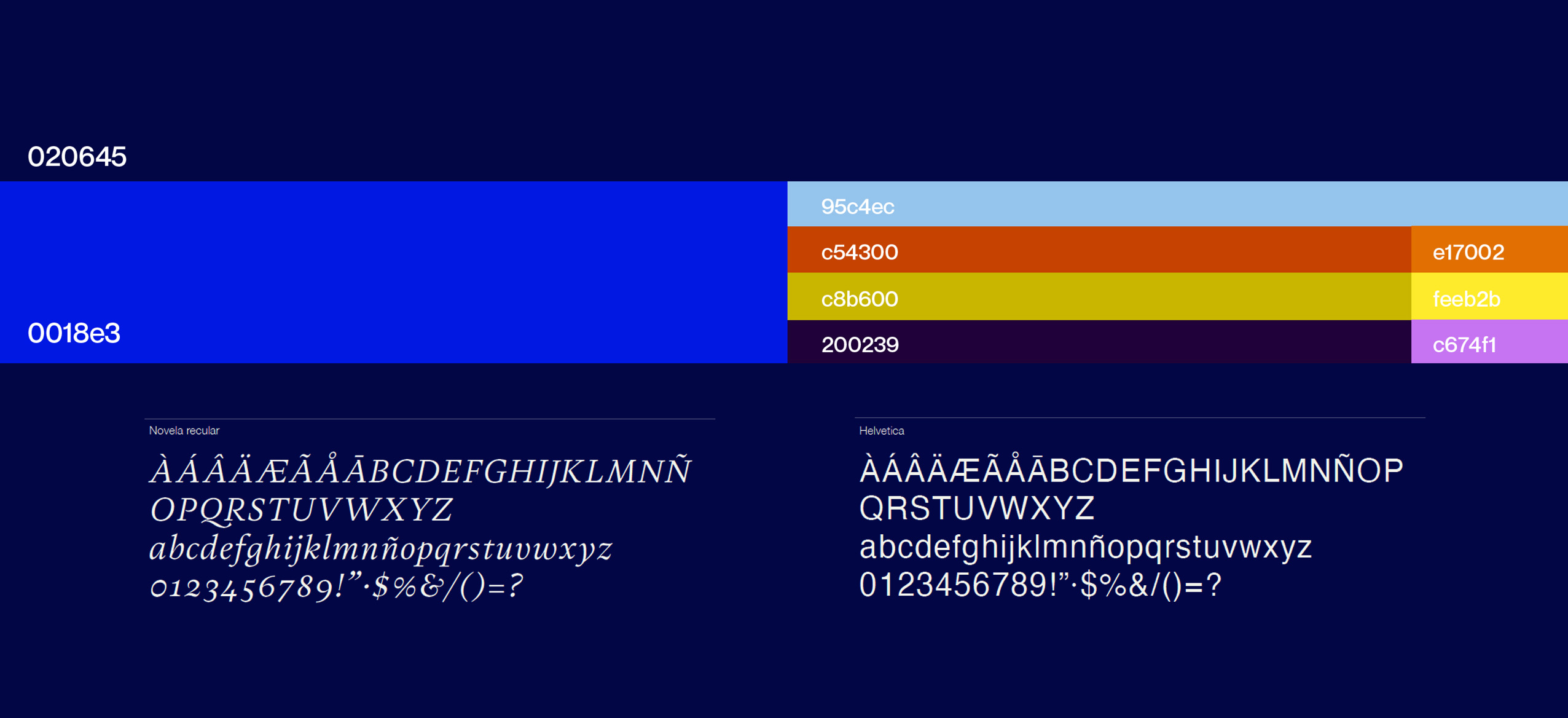
In the process of creating the visual identity and brand, the previous main color, blue, was retained but in a new shade that conveys seriousness and professionalism. Additionally, complementary colors such as yellow, orange, and violet were incorporated to strengthen the brand’s image. For the logotype, the goal was to differentiate it from the competition, which mostly uses sans serif typefaces. The concept of contrast was applied by using two completely different fonts: one sans serif (without strokes) and another serif (with strokes). The primary color selected was blue, representing trust, communication, and seriousness, and it was saturated just enough to convey a sense of modernity.
